Arkane Group
Arkane Group – an AI consultancy specializing in business automation and emerging technology solutions for ambitious mid-market companies.

Founded in 2024, Arkane set out to bridge the gap between cutting-edge AI technology and real-world business results for ambitious mid-market companies. They don't just implement artificial intelligence—they transform how businesses operate, solving complex challenges with innovative solutions that deliver measurable impact.
When Arkane approached us, they had the expertise and vision but needed a brand identity that could match their ambitions. In a crowded AI landscape, technical capability alone isn't enough. Success requires trust, and trust begins with a cohesive brand presence that communicates both innovation and reliability.
We developed a comprehensive brand ecosystem that positions Arkane as the strategic partner companies turn to when they're ready to seriously leverage AI. From creating flexible visual systems to designing cohesive touchpoints, we built an identity that reflects their unique position at the intersection of advanced technology and business pragmatism.

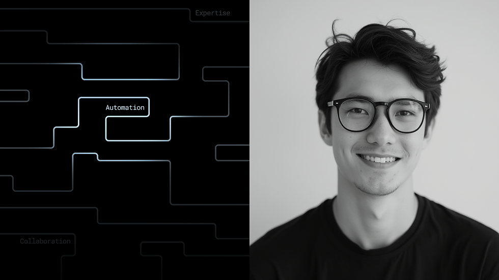
Our approach to the logo was guided by two key principles: visual differentiation from competitors and the establishment of a core metaphor that would permeate the entire visual system. We chose a typographic route, integrating the concept of a labyrinth—where Arkane's team always finds the way out and guides their partners through even the most complex challenges.
This metaphor comes to life through the strategic connection of letter bases and characteristic "cuts" in certain characters, giving the logo a distinctly futuristic quality. But the labyrinth concept extends beyond the wordmark itself.
The accompanying symbol emerges from this same labyrinthine philosophy, representing the intricate pathways of business partnerships and technological solutions. Just as Arkane navigates complex challenges together with their clients, the symbol visualizes these interconnected journeys that define successful implementation of innovative solutions. It's a visual manifestation of the bridges Arkane builds between ambitious companies and transformative technologies.


Building a new face for this competitive landscape, we knew we needed to claim our own color territory and establish a typographic system that would balance seamless integration with Google's ecosystem while authentically capturing the brand's essence. We had to find fonts that would not only work effortlessly within the team's workflow but also precisely convey Arkane's technological spirit.
We chose lime and turquoise as our primary brand colors—vibrant hues that create striking contrast against black, instantly signaling tech startup energy while clearly differentiating Arkane from competitors in the crowded AI space.
For typography, we crafted a thoughtful pairing between the more classical Chivo for headlines and Chivo Mono for body text. This combination gave us the variability we needed while introducing a subtle nostalgic quality—echoing the fonts of early computers and reinforcing the brand's technological heritage.


The core metaphor anchoring the brand became the labyrinth—a symbol of the complexities within under-automated business processes, through which Arkane's team guides their partners to the exit. This concept manifested graphically across key communication touchpoints, from the website to various marketing materials, creating a cohesive visual language.
To provide greater versatility across the entire identity system, we developed a suite of linear, minimalist illustrations. This approach allows complex technological processes to be communicated through simple visual language, giving Arkane another powerful tool for connecting with their audience.


Creating the website for Arkane, we solved a strategic challenge: how to position technologically complex AI products accessibly for mid-market businesses. Our approach was built on a clear storytelling structure that guides visitors from problem to solution.
The site structure is built around a simple yet powerful narrative arc. We begin with the core message "Making Business Simpler with AI"—a promise that immediately resonates with the target audience's pain points. Statistical data in the hero section builds trust and demonstrates the scale of possibilities that AI opens up.
The "WE FOCUS ON" section is strategically positioned as the heart of the site, where each of the four focus areas—from operational efficiency to innovation—is supported by linear illustrations that simplify complex concepts. This allows potential clients to quickly identify their needs.
The site's marketing strategy centers on differentiation through the "WHAT IS DIFFERENT ABOUT ARKANE" section. Instead of technical details, we emphasize pragmatic approach, personalized service, and results orientation—factors that matter for decision-making in mid-market businesses.


Creating the identity for Arkane Group, we solved the challenge of positioning an AI startup in a crowded technological landscape. Our approach was built on three key pillars: a powerful labyrinth metaphor that permeates the entire visual system; a thoughtful color palette with lime and turquoise that instantly differentiates the brand from competitors; and a flexible typographic system adapted to the realities of working within Google's ecosystem.
The result is a cohesive identity that combines technological expertise with a human approach. From the logo to minimalist illustrations, from a website with strategic storytelling to a system that works in daily workflows—every element serves the main goal: positioning Arkane as a trusted guide through the complexities of business automation.